

Introduction to CSS Flexbox
CSS Flexbox is a layout module that makes it easy to design flexible and responsive layouts in CSS. It allows you to specify how elements within a container should be aligned and distributed within that container, as well as how they should respond to changes in the size of the container.
Flexbox makes it easy to create layouts that are responsive to changes in screen size and device orientation, without the need for complex grid systems or media queries.
Basic Flexbox Terminology
Before diving into using Flexbox, it's important to understand some of the basic terminology used in the Flexbox model.
Flex Container
The element that contains the flex items is called the flex container. To create a flex container, you need to set the display property of an element to flex or inline-flex.
.container {
  display: flex;
}
Flex Items
Elements that are contained within a flex container are called flex items. Flex items will be aligned and distributed within the flex container based on the rules set by the container.
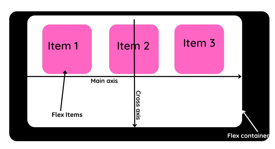
Main Axis and Cross Axis
In a flex container, the main axis is the axis along which the flex items are laid out. By default, the main axis is the horizontal axis (left to right). The cross axis is the axis perpendicular to the main axis.
Flexbox Properties
There are several properties that you can use to control the layout of flex items within a flex container.
flex-direction
The flex-direction property specifies the direction of the main axis. It can have the following values:
row: The main axis is the horizontal axis (left to right). This is the default value.row-reverse: The main axis is the horizontal axis, but the flex items are laid out in the opposite direction (right to left).column: The main axis is the vertical axis (top to bottom).column-reverse: The main axis is the vertical axis, but the flex items are laid out in the opposite direction (bottom to top).
.container {
  flex-direction: row; /* Default value */
}
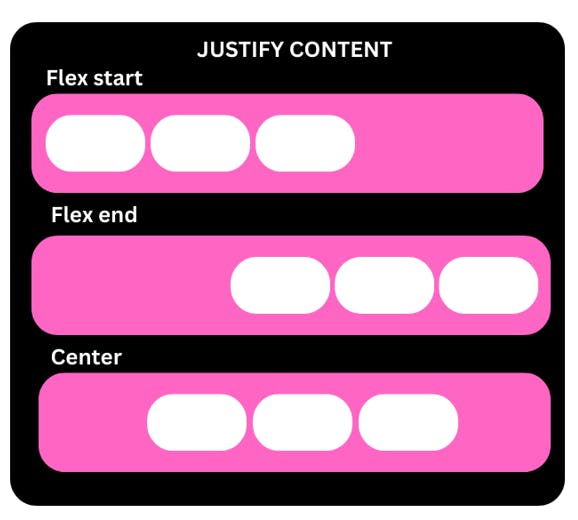
justify-content
The justify-content property specifies how the flex items are aligned along the main axis. It can have the following values:
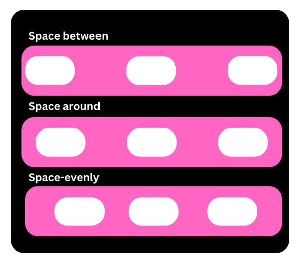
flex-start: The flex items are aligned to the start of the main axis (left for a row, top for a column). This is the default value.flex-end: The flex items are aligned to the end of the main axis (right for a row, bottom for a column).center: The flex items are centered along the main axis.space-between: The flex items are evenly distributed along the main axis, with the first and last items aligned to the start and end of the main axis, respectively.space-around: The flex items are evenly distributed along the main axis, with equal space around each item.
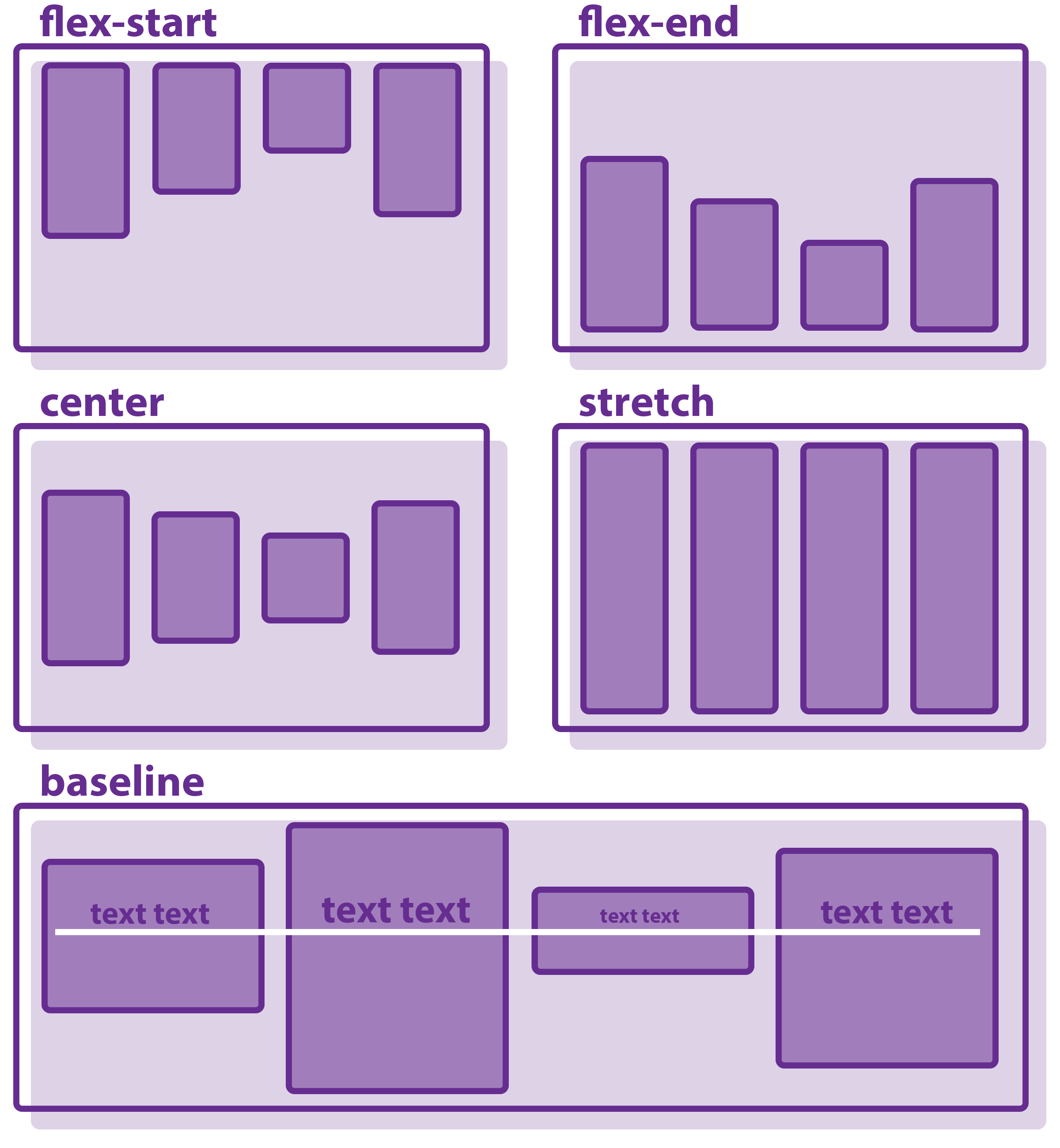
align-items
The align-items property specifies how the flex items are aligned along the cross-axis. It can have the following values:
The align-items property accepts the following values:
flex-start: Aligns the items to the start of the cross-axis.flex-end: Aligns the items to the end of the cross-axis.center: Aligns the items to the center of the cross-axis.baseline: Aligns the items along their baselines.stretch: Stretches the items to fill the flex container along the cross-axis. This is the default value.
.container {
  display: flex;
  align-items: flex-start;  /* align items to the start of the cross axis */
}
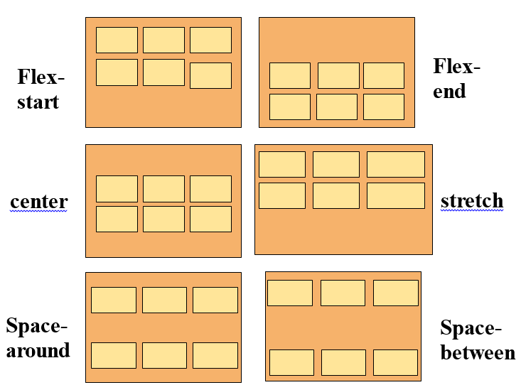
align-content
The align-content property aligns a flex container's lines along the cross-axis when there is extra space in the container. It has the following values:
flex-start: lines are aligned to the start of the cross axisflex-end: lines are aligned to the end of the cross axiscenter: lines are centered along the cross axisspace-between: lines are distributed such that the first and last lines are aligned to the start and end of the cross-axis, and the remaining lines are evenly distributed in betweenspace-around: lines are distributed such that there is an equal amount of space around each linestretch: lines are stretched to fill the full height of the container (if the main axis is horizontal) or the full width of the container (if the main axis is vertical)
Note that align-content only has an effect when there is extra space in the flex container.
Here's an example of using align-content to center flex lines along the cross-axis:
Copy code.container {
  display: flex;
  align-content: center;
}
align-content
The align-content property aligns a flex container's lines along the cross axis when there is extra space in the container. It has the following values:
flex-start: lines are aligned to the start of the cross axisflex-end: lines are aligned to the end of the cross axiscenter: lines are centered along the cross axisspace-between: lines are distributed such that the first and last lines are aligned to the start and end of the cross-axis, and the remaining lines are evenly distributed in betweenspace-around: lines are distributed such that there is an equal amount of space around each linestretch: lines are stretched to fill the full height of the container (if the main axis is horizontal) or the full width of the container (if the main axis is vertical)
Note that align-content only has an effect when there is extra space in the flex container.
Here's an example of using align-content to center flex lines along the cross-axis:
Copy code.container {
  display: flex;
  align-content: center;
}
Flex Item Properties
In addition to the container-level properties discussed above, you can also control the layout of individual flex items using the following properties:
order
The order property allows you to specify the order of flex items within a flex container. By default, items are ordered in the same order they appear in the HTML. You can use the order property to change the order of items.

Copy code.item {
  order: 2;
}
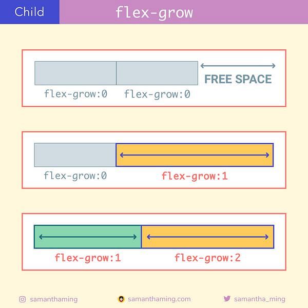
flex-grow
The flex-grow property determines how much a flex item should grow relative to the other items in the flex container. By default, all flex items have a flex-grow value of 0.
Copy code.item {
  flex-grow: 1;
}
flex-shrink
The flex-shrink property determines how much a flex item should shrink relative to the other items in the flex container. By default, all flex items have a flex-shrink value of 1.
.item {
  flex-shrink: 2;
}
flex-basis
The flex-basis property specifies the initial size of a flex item. It can be set to a length value (e.g. 200px) or a percentage value (e.g. 50%). If set to auto, the item will take up the remaining space in the flex container.
Copy code.item {
  flex-basis: 200px;
}
align-self
The align-self property allows you to override the align-items property for a specific flex item. It has the same values as align-items.
Copy code.item {
  align-self: flex-end;
}
Conclusion
CSS flexbox is a powerful tool for building responsive and flexible layouts. With its various container and item properties, you can easily align and distribute elements within a container to create a wide range of layouts. Whether you're building a simple two-column layout or a complex responsive design, flexbox can help you get the job done.
Resources
Here are some additional resources for learning more about flexbox:
A Complete Guide to Flexbox - an in-depth guide to flexbox by CSS-Tricks
Flexbox Froggy - a fun game for learning flexbox
Flexbox Zombies - a flexbox tutorial in the form of a zombie survival game
MDN: Flexbox - the official documentation for flexbox on MDN