

A Comprehensive Guide to CSS Grid
CSS Grid is a two-dimensional layout system for the web that allows you to create layouts with rows and columns. It is a powerful tool that allows you to have complete control over the placement of elements on a page, and it can greatly simplify the process of creating complex layouts.
Getting Started with CSS Grid
To use CSS Grid, you need to create a grid container by setting the display property of an element to grid. You can then define the rows and columns of the grid using the grid-template-rows and grid-template-columns properties.
.container {
  display: grid;
  grid-template-rows: 50px 50px;
  grid-template-columns: 100px 100px;
}
This will create a grid with two rows and two columns, with each cell having a width of 100px and a height of 50px.
You can also use the grid-template shorthand property to define both rows and columns at the same time.
.container {
  display: grid;
  grid-template: 50px 50px / 100px 100px;
}
Placing Elements on the Grid
Once you have defined your grid, you can place elements within it using the grid-column and grid-row properties.
.item1 {
  grid-column: 1 / 3;
  grid-row: 1 / 2;
}

.item2 {
  grid-column: 2 / 3;
  grid-row: 2 / 3;
}
In this example, .item1 will span across the first and second columns of the first row, while .item2 will be placed in the second column of the second row.
You can also use the grid-area shorthand property to specify both rows and columns at the same time.
.item1 {
  grid-area: 1 / 1 / 2 / 3;
}

.item2 {
  grid-area: 2 / 2 / 3 / 3;
}
Grid Gaps
You can use the grid-gap property to add space between rows and columns in your grid.
.container {
  display: grid;
  grid-template-columns: 1fr 1fr 1fr;
  grid-gap: 20px;
}
This will add a 20px gap between each column and each row in the grid. You can also use the grid-row-gap and grid-column-gap properties to specify different gaps for rows and columns.

.container {
  display: grid;
  grid-template-columns: 1fr 1fr 1fr;
  grid-row-gap: 10px;
  grid-column-gap: 20px;
}
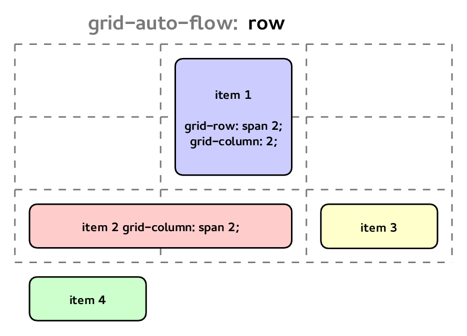
Grid Auto-Placement
If you have more items than there are cells in your grid, you can use the grid-auto-flow property to control how the extra items are placed. By default, items will be placed in the order they appear in the HTML, filling up rows from left to right and then moving down to the next row.
.container {
  display: grid;
  grid-template-columns: 1fr 1fr 1fr;
  grid-auto-flow: row;
}
You can also use the grid-auto-flow: column value to have items flow down the columns instead.
.container {
  display: grid;
  grid-template-columns: 1fr 1fr 1fr;
  grid-auto-flow: column;
}
If you want to have items automatically placed in empty cells, you can use the grid-auto-flow: dense value. This will fill up empty cells with items, even if it means rearranging the order of the items.
.container {
  display: grid;
  grid-template-columns: 1fr 1fr 1fr;
  grid-auto-flow: dense;
}
Grid Alignment
CSS Grid provides several properties for aligning items within the grid. You can use the justify-items and align-items properties to align items along the row and column axes, respectively.

.container {
  display: grid;
  grid-template-columns: 1fr 1fr 1fr;
  justify-items: center;
  align-items: center;
}
This will center all items within their cells along both the row and column axes.
You can also use the justify-self and align-self properties to align individual items.
.item1 {
  justify-self: start;
  align-self: start;
}

.item2 {
  justify-self: end;
  align-self: end;
}
This will align .item1 to the start of its cell along both axes, and .item2 to the end of its cell along both axes.
Conclusion
CSS Grid is a powerful tool for creating flexible and responsive layouts for the web. With a little bit of practice, you can use it to create a wide variety of layouts that adapt to different screen sizes and device types. Whether you are just starting out with CSS Grid or are an experienced developer looking to take your skills to the next level, there is always more to learn and explore with this exciting layout system.
Further Reading
To learn more about CSS Grid, check out the following resources: